Small Change, Big Impact: Recessed Lighting Installation

I recently had the pleasure of working with a family in Great Falls to make some key changes to their home. When it came to their teenage daughter’s room, we weren’t planning on doing too much – often allowing teenagers to control and decorate their own room can be a great form of their self-expression, and great for their mental health. But when I looked around her room, I knew one key change would have a major impact. She needed a lot more light! Keep reading to find out why and how we installed recessed lighting into this teenage girl’s room.

The Need

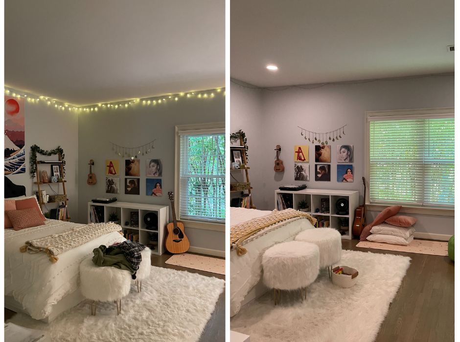
The light in a room is crucially important – it completely sets the mood and atmosphere. Additionally, there’s a major practical element that comes with lighting. For instance, in her room, there was no lighting installed, just a large window. And while this window may have been able to let in an appropriate amount of light, it was entirely shaded by a crape myrtle. Even if it didn’t, I still think she still would’ve needed ceiling light – for instance in the wintertime when the sun sets before she’s had time to do her homework at her desk. It was clear that she wanted a bit more light as well, with the way she had set her room up. There was a floor lamp and string lighting along the ceiling. While that lighting may have been nice right before bed, it wasn’t nearly enough light, and areas like her desk were left in the shade.

Installing something like ceiling lighting takes trained contractors and is likely beyond the breadth of a DIY home decor video on youtube. That’s where my team and I came in. We decided to go for recessed lighting, rather than say a hanging ceiling light, for a few reasons. The first is that the ceilings of this bedroom were not particularly high. Therefore, anything that was hanging or coming out from the ceiling would make the entire room feel shorter all together. Additionally, because of the size of the room, and especially where her desk was, I wanted to make sure that a good amount of light reached all corners of the room. Just one central light wouldn’t do that to the same effect as something like recessed light. Recessed lights are installed into the ceiling and lay flush against it. You almost always install more than one light, which gives you easy control over where in the room they’re placed. Because of this, I knew that installing recessed lighting was the way to go. My team and I got to work.

Let There Be Light

We decided to install four lights, approximately 25” from each corner of the room. This was going to bring symmetry and ensure the entire room had even lighting. The lights needed to be big enough to provide enough light for the room, but if they were too big, they would easily become an eyesore. 6 inches seemed to be a perfect size.

The actual process of installing the recessed lighting involved making cuts into the ceiling where the lights would be installed – it’s really important that these cuts are perfectly placed and the perfect size for the light, which is why we’d always suggest getting a professional in rather than attempting to do this yourself. Once the holes were ready, my contractor wired the electric through and installed the lights. We used LED bulbs which last much longer and use less energy – better for the environment. 

Out of Darkness

The finished result almost seems like a different room. Not only does this new lighting mean she won’t have to spend her mornings and evenings in the dark, but her desk will be well lit for her to use. Additionally, the extra light allows you to better see the wall art and decor, giving you an insight into who this bright young lady is. I’m really happy with the final results. But of course, the most important thing is that my clients were also really happy with the final results.

If you think an area in your home is in need of new lighting, get in contact today! At Kelley Astore Interiors, we have ongoing relationships with a range of licensed contractors and skilled craftsmen who work under our supervision on all our projects. Get in touch to book your free consultation today!


Family Room Transformation: Fireplace & Mantelpiece Before and After

A few months ago, we posted an article on adding dimension and texture to a room through woodwork, where we installed beautiful beadboard paneling on the ceiling of a family room in Reston, VA. Today, we’re going to take you through the rest of the transformation of this family room, and how we achieved it.

The Before

The original room has some beautiful bones – the angled ceiling paired with the floor-to-ceiling brickwork around the fireplace gives the room a lovely shape. However, the walls were painted with a deep red color, making the entire room feel a little small and outdated. Additionally, the wooden floors in this room are incredibly beautiful – a medium-toned wood that was completely drowned out by this aggressive red color. The exposed brick did not match the tone of the walls. Most of the furniture surrounding the fireplace was very short, and in my opinion, a waste of space. One of the best parts of this room is just how tall it is. So I knew that we needed to accentuate that. 

The fireplace is clearly the central focus of the room, as it should be. I think that fireplaces are a beautiful feature for any room. I absolutely love the way that this one was designed, with the bricks reaching all the way to the ceiling, and the juxtaposition of the rounded frame around the fireplace, the straight mantelpiece, and the angled corners at the top. The fireplace was going to stay, but I wanted to find a way to use the space more cleverly and give everything that modern update that it was craving.

During

The first step, of course, was planning. I wanted to use the height of the room be to our advantage. I also wanted to extend the framing of the fireplace with two bespoke built-in bookcases on either side. It was important to me that the bookcases didn’t seem placed in the room, but rather a part of the room’s structure. That’s why we opted for bookcases that had shelves to create an angled corner so it seemed like the bookcase was almost emerging from the wall. These shelved corners created a bit of a round shape, which complimented the curved brickwork around the fireplace. As we were installing the new bookcases, we removed the original mantelpiece and marked exactly where the TV would go above the fireplace. We used joinery to connect each bookcase to the bottom trim along the floor, as well as a new mantelpiece connecting the two bookcases over the fireplace. 

Once the bookcases were installed and our woodwork complete, it was time to begin pulling the design together. I loved the white color of all the wood, including the wood on the ceiling. I wanted to highlight that, so we opted for a beautiful neutral color from Ralph Lauren. While I wanted the fireplace and the walls to be similar shades, I still wanted them to be different. So I chose to use matte paint on the wall, and glossy paint on the brick. This paintwork allowed the brickwork and the woodwork to stand out in a lovely and subtle contrast that felt modern and purposeful.

After we finished the major components of the room, the final step was styling. I felt that the original room felt crowded, so we kept the decor to a minimum, allowing the shape and structure of the room to really stand out. My client filled her new bookcases with wonderful family collections of books, beautiful artwork, and antique weathervanes. 

The After

I love the way that the finished mantelpiece and fireplace turned out. It feels like the entire room has been brought up to date. The white woodwork and the wooden floors look beautiful against the glossy bricks. The styling is much more minimal, making the room seem bigger and cleaner. And all of it looks beautiful underneath the beadboard ceiling. As always, the most important thing is that my client was happy with how it turned out.

If you’re interested in renovating or remodeling a room in your house, let us help you turn your dreams into reality! Head to our services page to see how we can help you today. 


Bathroom transformation: Custom Made Vanity

Last week I took you through a before and after transformation of a master bathroom – a plain, one-dimensional bathroom was transformed into a luxurious modern and chic washroom. What I love about designing bathrooms is that all bathrooms are more or less the same…or at least expected to feature the same things: toilet, sink/vanity, shower/bath, and mirror. Because of this, creating a bathroom that really stands out is no easy feat. Every decision is important, no detail missed, with each element deserving careful intention. Today, I’ll be showing you how much thought goes into each element by taking you through how we custom-made the vanity that featured in the final design.

The Original Vanity

The original vanity in the space was boring. There was nothing special about it – and to me, that is the worst place that a design can fall. I would always rather make bold choices and take risks than play it safe and run the risk of being boring. It was clear that the original vanity was designed to be functional, and that’s exactly what it was. With it’s two sinks, plain cupboards and drawers, and plain white counter, it simply got the job done and nothing more. Other than the silver hardware, it was all the same tone and dimension. It was the perfect example of how, without the detail and creativity that a bathroom craves, it will quickly fade into the background and become a space that serves a specific purpose, rather than a space that creates a feeling and atmosphere as well as serving a specific purpose.

Designing the New Vanity

I always opt for custom-made cabinetry and storage spaces where I can. I feel that it gives me more creative freedom and that’s exactly what I needed when designing this bathroom. I wanted to think outside the box for each detail. Because the overall vibe of the finished bathroom was going to be chic and clean, I didn’t want to use any extravagant colors or patterns. I wanted to keep it classic and timeless, while still having that “oomph.” I knew the perfect way to achieve this was through the woodwork. Woodwork is one of my favorite ways to have texture to a design – you quite literally create ridges and dimensions that the eye finds interesting. 

The whole bathroom design features a lot of geometric shapes and patterns, as seen in the floor tiles. I wanted to incorporate that motif into this vanity, so I decided to have these beautiful diamond shapes designed onto the cabinet doors below the sinks. Placing the diamond shapes below the round sink created lovely contrast, while still matching the floor. For an extra unique detail, we built three sets of drawers with one set of drawers unconventionally running in between the two cabinets. This felt really interesting to look at and is extremely practical. For a clean bathroom look, you need to have a lot of storage, and I find drawers a fantastic option for bathrooms. Additionally, if there are two people using this bathroom, each will have their own set of drawers, with the set in the middle a perfect place to store shared items like toothpaste and extra towels. 

With the framework and basic layout down, we were able to move on to all the finishing details to tie the vanity together.

The Finishing Details

As stated previously, we didn’t want any bold patterns or colors on the vanity, largely because we loved the floor tiles and wanted those to stand out. Because of this, we decided to keep the color scheme neutral, choosing shades and tones that would help those tiles stand out. The base of the vanity was painted with Benjamin Moore’s China White. Of course, we had to use marble for the countertop, so we chose one from Marble Systems Fairfax. We went with a marble that had nice veining but used a light gray against white. This provided something interesting for the eye to dance on, without being too distracting. The grey and white tones really complimented the rest of the color scheme in the bathroom.

Paired with two beautiful silver mirrors from Restoration Hardware, all fittings were done in polished chrome from Rohl. The shiny silver and chrome really helped provide that luxe effect, while still complimenting the color palette we chose. Our vanity lights were also from Restoration hardware, but we custom-made the lampshades in a gorgeous gray silk from Fabricut.

The result

I love the way that the final vanity turned out. I think it is so chic and clean, while still being super interesting. The woodwork really brings it together for me and goes to show that details don’t have to be extravagant or massive in order to have an effect. It was relatively simple changes made from the first vanity to the new vanity, but one blends into the background and provides nothing more than a place to wash up and the other brings its own finesse. Guess which one I prefer!

If you are looking to renovate your bathroom or have cabinetry in need of transformation, let us help you! Among interior designers in Northern Virginia, we are unique because virtually all of our cabinets, upholstery, and window treatments are completely custom-designed. We have ongoing relationships with a range of licensed contractors and skilled craftsmen who work under our supervision on all our projects. Head to our services page to discover how we could collaborate!


Kelley Astore Interiors

Expert Interior Design & Renovation Services of Every Style.

Where We Work

Northern Virginia, Washington, DC,
and the Greater Washington Area

GET IN TOUCH
Connect

Privacy Settings
We use cookies to enhance your experience while using our website. If you are using our Services via a browser you can restrict, block or remove cookies through your web browser settings. We also use content and scripts from third parties that may use tracking technologies. You can selectively provide your consent below to allow such third party embeds. For complete information about the cookies we use, data we collect and how we process them, please check our Privacy Policy
Youtube
Consent to display content from Youtube
Vimeo
Consent to display content from Vimeo
Google Maps
Consent to display content from Google
Call Now ButtonCall Us For A Quote!