Bathroom transformation: Custom Made Vanity

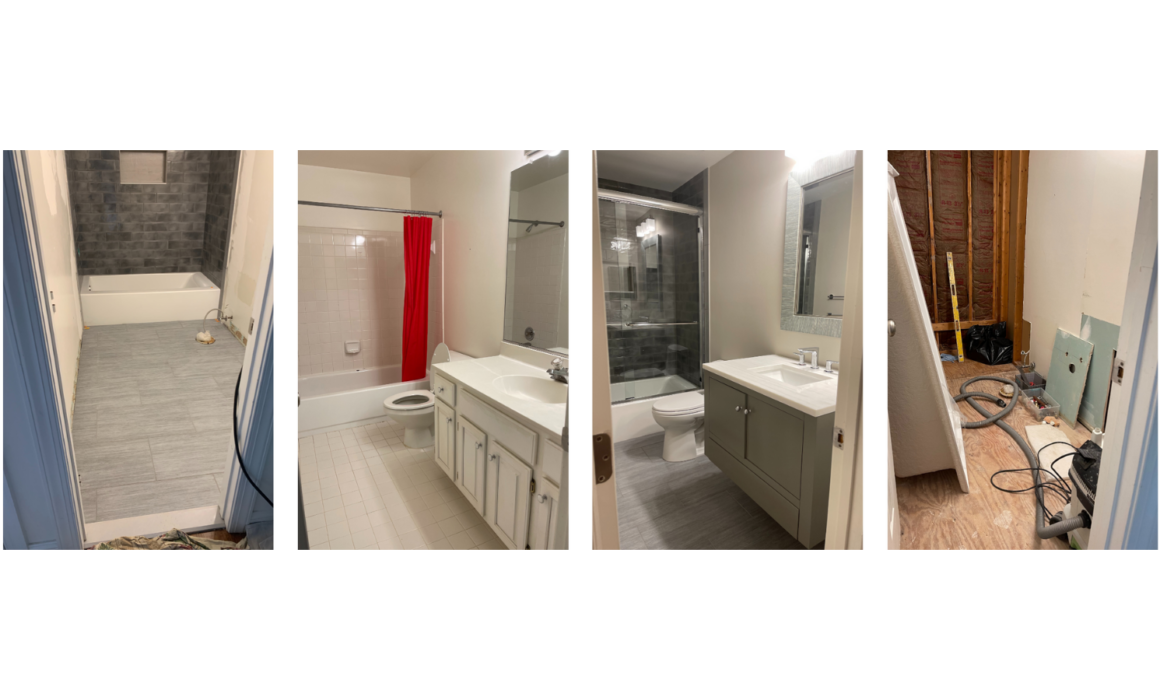
Last week I took you through a before and after transformation of a master bathroom – a plain, one-dimensional bathroom was transformed into a luxurious modern and chic washroom. What I love about designing bathrooms is that all bathrooms are more or less the same…or at least expected to feature the same things: toilet, sink/vanity, shower/bath, and mirror. Because of this, creating a bathroom that really stands out is no easy feat. Every decision is important, no detail missed, with each element deserving careful intention. Today, I’ll be showing you how much thought goes into each element by taking you through how we custom-made the vanity that featured in the final design.

The Original Vanity

The original vanity in the space was boring. There was nothing special about it – and to me, that is the worst place that a design can fall. I would always rather make bold choices and take risks than play it safe and run the risk of being boring. It was clear that the original vanity was designed to be functional, and that’s exactly what it was. With it’s two sinks, plain cupboards and drawers, and plain white counter, it simply got the job done and nothing more. Other than the silver hardware, it was all the same tone and dimension. It was the perfect example of how, without the detail and creativity that a bathroom craves, it will quickly fade into the background and become a space that serves a specific purpose, rather than a space that creates a feeling and atmosphere as well as serving a specific purpose.

Designing the New Vanity

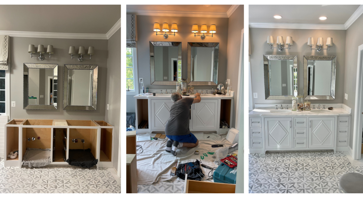
I always opt for custom-made cabinetry and storage spaces where I can. I feel that it gives me more creative freedom and that’s exactly what I needed when designing this bathroom. I wanted to think outside the box for each detail. Because the overall vibe of the finished bathroom was going to be chic and clean, I didn’t want to use any extravagant colors or patterns. I wanted to keep it classic and timeless, while still having that “oomph.” I knew the perfect way to achieve this was through the woodwork. Woodwork is one of my favorite ways to have texture to a design – you quite literally create ridges and dimensions that the eye finds interesting. 

The whole bathroom design features a lot of geometric shapes and patterns, as seen in the floor tiles. I wanted to incorporate that motif into this vanity, so I decided to have these beautiful diamond shapes designed onto the cabinet doors below the sinks. Placing the diamond shapes below the round sink created lovely contrast, while still matching the floor. For an extra unique detail, we built three sets of drawers with one set of drawers unconventionally running in between the two cabinets. This felt really interesting to look at and is extremely practical. For a clean bathroom look, you need to have a lot of storage, and I find drawers a fantastic option for bathrooms. Additionally, if there are two people using this bathroom, each will have their own set of drawers, with the set in the middle a perfect place to store shared items like toothpaste and extra towels. 

With the framework and basic layout down, we were able to move on to all the finishing details to tie the vanity together.

The Finishing Details

As stated previously, we didn’t want any bold patterns or colors on the vanity, largely because we loved the floor tiles and wanted those to stand out. Because of this, we decided to keep the color scheme neutral, choosing shades and tones that would help those tiles stand out. The base of the vanity was painted with Benjamin Moore’s China White. Of course, we had to use marble for the countertop, so we chose one from Marble Systems Fairfax. We went with a marble that had nice veining but used a light gray against white. This provided something interesting for the eye to dance on, without being too distracting. The grey and white tones really complimented the rest of the color scheme in the bathroom.

Paired with two beautiful silver mirrors from Restoration Hardware, all fittings were done in polished chrome from Rohl. The shiny silver and chrome really helped provide that luxe effect, while still complimenting the color palette we chose. Our vanity lights were also from Restoration hardware, but we custom-made the lampshades in a gorgeous gray silk from Fabricut.

The result

I love the way that the final vanity turned out. I think it is so chic and clean, while still being super interesting. The woodwork really brings it together for me and goes to show that details don’t have to be extravagant or massive in order to have an effect. It was relatively simple changes made from the first vanity to the new vanity, but one blends into the background and provides nothing more than a place to wash up and the other brings its own finesse. Guess which one I prefer!

If you are looking to renovate your bathroom or have cabinetry in need of transformation, let us help you! Among interior designers in Northern Virginia, we are unique because virtually all of our cabinets, upholstery, and window treatments are completely custom-designed. We have ongoing relationships with a range of licensed contractors and skilled craftsmen who work under our supervision on all our projects. Head to our services page to discover how we could collaborate!


Before and After Transformation: Master Bathroom

The bathroom is where you begin and end the day – it’s important that it’s a space where you can feel clean and calm. Personally, I believe that the best bathrooms are ones that feel open and airy, full of light, to start the day with a feeling of a fresh start. Likewise, it’s important that the lighting fixtures are appropriate for a nice atmosphere in the evenings before bed. That’s why this week we’re bringing you a master bathroom transformation – to show you just what a difference design can make!

The Before

The original bathroom was alright. There was nothing wrong with it, so to say. But it was all one-dimensional. Nothing about this bathroom excited me. I really did not like the way that the drapery fell over the windows – there was too much fabric and the color did not really match the general atmosphere. The built-in bathtub was very large, giving a feeling of luxury – but it wasted a lot of space and made the entire bathroom feel smaller. The warm lights combined with the pale yellow wall color made the whole room feel yellow – which is not the ideal color for a bathroom if you ask me. Something about the color scheme made everything feel outdated. One look at this bathroom and I knew that a drastic transformation could take place – and it would be one that would be worth it.

The Design & Process

When first designing this bathroom, I knew I wanted to opt for a more neutral color scheme, focusing on whites and greys – this would look beautiful with natural lighting and feel very clean. To begin, we painted the walls in Farrow & Ball Pavillion Gray #242 as our starting point. The next thing we wanted to tackle were the floors. The bathroom is one of my favorite places to experiment with tiles, because there are so many areas where tiles are appropriate – on the floors, around the shower, etc. I chose an array of tiles for the floor, the shower, and some detail work. I wanted to play with different patterns, to ensure the final design had a lot of texture and dimension, unlike the original. 

Additionally, I wanted to ensure that the whole design featured lots of little details – this would help keep the eye fluttering across the room, while still holding true to a simple and clean design. One of the areas I was able to achieve this was in the shower. I chose a classic white and grey marble tile for the majority of the shower walls. But I wanted to create a little arched wall niche in the shower – the perfect place for soaps and toiletries. This little alcove was such a great opportunity to get patterned tiles in, this time in mosaic, the same as the shower floor. My contractors did a fantastic job creating this arch – truly only a real stone craftsman can produce something this perfect, because it involves cutting and shaping all of the stone/tile manually. I’m always so grateful to have the best team!

I also managed to get a lovely texture incorporated into the custom vanity we had built for this bathroom. I love the diamond shapes in the doors and the way that the drawers are installed – slightly unconventionally. I think there’s little more luxurious than having two bathroom sinks, so that’s what we opted for. We chose to have a freestanding tub to create more floor space and open the bathroom up – additionally, we opted for glass shower doors rather than curtains to keep the space feeling airy. 

We sourced the mirrors and vanity lights from Restoration Hardware, with the vanity lamp shades custom made in my workroom in gray silk by Fabricut. To really tie the entire design together, we chose to use roman shades which really elevates a room. We used linen from Pindler & Pindler and hand-embroidered decorative tape from Samuel & Sons to tie all the patterns together. Unlike the previous shades, I made sure that these were not bulky, but rather lay flat. Lastly, we installed a toilet from Toto (my favorite place to source toilets) and had chrome hardware installed to match the metallic of the mirrors. All of the plumbing supplies, faucets, and fittings were from Rohl in polished chrome.

The Finished Bathroom

I am incredibly proud of how this bathroom turned out. I think it feels elevated, clean, luxurious, and bright…truly the best place to start and end each day. I think the two bathrooms are so radically different, you may not even tell that they were once the same bathroom!

If you are interested in renovating a bathroom in your house – let us help you! Head to our services page to book your free consultation today. 


Small Modern Bathroom Designed for Boys

We are back with another home renovation and this time we are moving to the bathroom – specifically a bathroom that will be used by two young boys. Design is all about the marriage of functionality and beauty. Whenever I design for kids, I make sure to spend extra time with the function of the design, as children have different and unique needs to be catered to. Keep reading to discover this incredible modern bathroom transformation for boys!

Before We Begin

When looking at the before photos, it’s clear that a lot of work needs to happen – especially aesthetically. Bathrooms are one of the areas of the house where, even if the entire room has been cleaned properly if it looks old or outdated, something about it doesn’t feel clean. Bathrooms are also really susceptible to water damage and mold, so it’s always a good idea to make sure nothing needs to be treated before beginning the actual design. For both of these reasons, we decided to gut the entire bathroom and start fresh – my preferred way of remodeling bathrooms. 

My contractors and I got to work tearing out the old bathroom. Thankfully we didn’t find any terrible water damage, so this process was relatively quick and pain-free. Now is where the real fun begins.

Laying the groundwork

Because we cleared out the room down to it’s studs, we had to do some prep before the transformation could start. We installed cement boards on the walls before installing the tiling. This is important for a few reasons – it gives you the necessary flat surface needed to attach the tiles, and it protects the wood below from any possible water damage. Once those were up, we got to work tiling the bathroom and installing new floors. We kept the design relatively simple and neutral for practicality’s sake. Although young boys might find spiderman wallpaper more exciting, the client and I both agreed to keep it classy so that the boys don’t absolutely hate it as they get older. We chose a simple dark grey 4 x 12 tile for the shower/bath area to provide contrast with the wall color we would eventually use. The floors we chose are simple light gray large 12 x 24 tile. Choosing a large tile for the floor made the small bathroom seem that much larger.

The Shower

The plumbing is, without a doubt, the most important part of any bathroom. We decided to keep the same general layout of the original bathroom for ease, to avoid having to reinstall all the pipes. We started with installing a built-in bathtub with a shower to give the boys options. Next we replaced the original shower curtain with sliding shower doors. Shower doors mean no mildew, never having to change or replace the shower curtain, and a dryer bathroom. We also installed towel rods onto the shower doors so the boys would have no excuse not to hang their towel up! 

The Toilet

Next we put in the new toilet. Because two children were going to be using this toilet, we chose one from Toto Toilet that has a special finish on it called Sani Gloss to help keep the bowl clean. Any parents out there will know how difficult it can be to get your children to help with the cleaning, so we felt this was the best and safest option. We chose a toilet that was simple and white.

The Vanity and Sink

All that was left to do plumbing wise was the sink! We knew we wanted to build a custom modern vanity for this room. The previous vanity was very large, making the rest of the bathroom feel very small. We decided to downsize and avoid the all-white look. So we built a vanity with a cabinet that floated on the wall, slightly above the floor. We chose a floating vanity to create the illusion of a larger space. It also makes cleaning easier, with the floor below the vanity accessible, avoiding trapped dust. We installed a beautiful light colored marble counter on top, with a large modern-sink. 

All the plumbing fixtures in this bathroom were done with chrome. Chrome never ages, and looks great. Not only that, but it matches well with pretty much any other color and material. Practical and beautiful!

Finishing Touches

After all the plumbing and the vanity were installed, the most functional aspects of the bathroom had already been taken care of. Now it was just a matter of making it look beautiful. Keeping with the neutral theme, we painted the walls in Benjamin Moore #860 in Apparition, a classic and timeless shade. The vanity also used Benjamin Moore paint, this time in #168 HC Chelsea Gray. Similar in tone to the wall-paint, this darker shade offered a lovely contrast, acting as a bridge between the light colored walls and the dark shower tiles. Finally, we put up a mirror, smaller than the previous, with a simple grey and white striped pattern. We installed a light right above the mirror as a sophisticated detail. 

Final Thoughts

I think the design turned out great, especially considering how practical it is for the two young boys who will be using it. I hope they enjoy their new bathroom now and as they grow up! For more articles on our bathroom renovations, check out our other articles. If you are interested in renovating a bathroom in your home, get in touch today!


Kelley Astore Interiors

Expert Interior Design & Renovation Services of Every Style.

Where We Work

Northern Virginia, Washington, DC,
and the Greater Washington Area

GET IN TOUCH
Connect

Privacy Settings
We use cookies to enhance your experience while using our website. If you are using our Services via a browser you can restrict, block or remove cookies through your web browser settings. We also use content and scripts from third parties that may use tracking technologies. You can selectively provide your consent below to allow such third party embeds. For complete information about the cookies we use, data we collect and how we process them, please check our Privacy Policy
Youtube
Consent to display content from Youtube
Vimeo
Consent to display content from Vimeo
Google Maps
Consent to display content from Google
Call Now ButtonCall Us For A Quote!