
Spring Pastel Paint Trends
Pastels lend a dreamy background; they are crisp, uplifting, and luminous. Light-enhancing pales awaken the senses creating serenity and making room for play. New paint has the power to self-express and energize moods. If your idea of spring cleaning involves giving your walls a fresh coat of paint, you’ll want to have a look at these pastel color trends.
Subtle Sage
Green is a botanical shade. It is the color of nature, newness, and growth and offers a revitalizing atmosphere. When green is softened enough, it can serve as a neutral color and can be paired with bold accent colors. A subtle green is possibly the most popular paint color trend for Spring 2022 because it was picked by two of my favorite paint brands as their Color of the Year.
Benjamin Moore’s Color of the Year 2022 is October Mist 1495. It is a quiet and meditative shade yet offers diversity and can be substituted as a neutral because it works with many different colors, textures, and elements. “Due to its calming nature, this gently shaded sage works particularly well in a bedroom or study, and we also love the soothing mood it creates in a bathroom,” says Andrea Magno, Benjamin Moore’s director of color marketing and development.
Sherwin Williams’s Color of the Year 2022 is Evergreen Fog. Just as the fog clears with the rising of the morning sun signifying a new day, Evergreen Fog inspires us to begin again. It is an attractive color of green meeting gray that is versatile. “It’s a usable mid-tone that allows you to put a personal stamp on your home without having to jump into really bold or bright color,” explains Sue Wadden, director of color marketing at Sherwin-Williams.
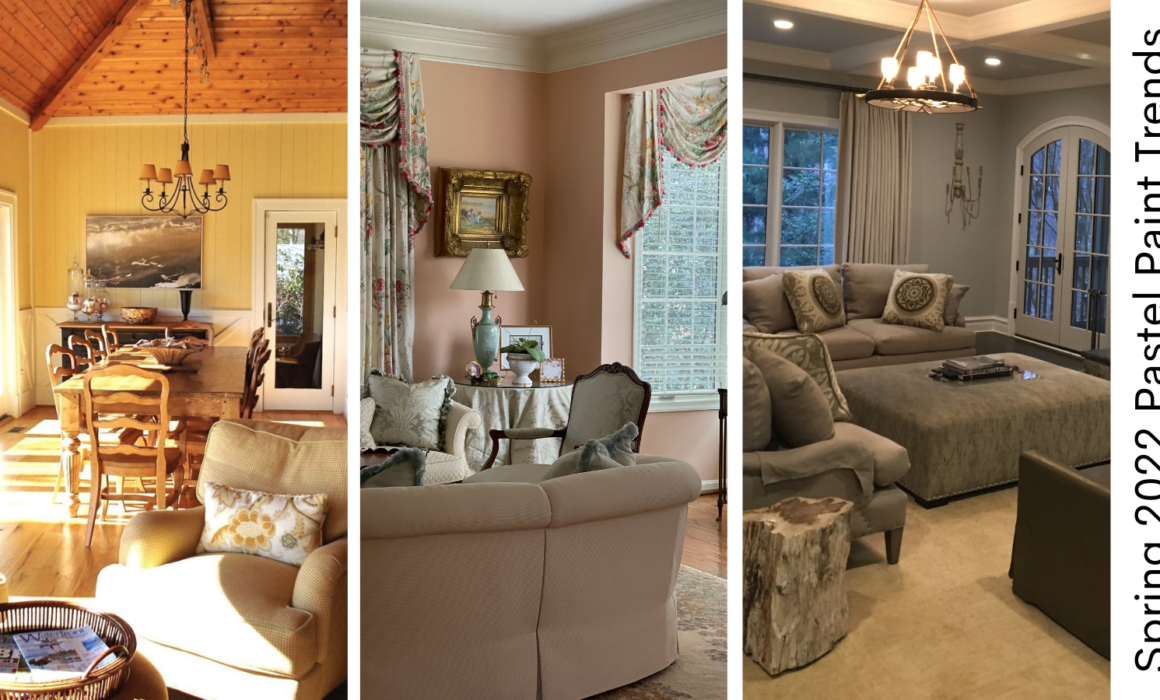
Soft Citrus Yellow
Yellow is the shade of optimism and joy. It allows you to infuse sunshine into a room, creating a summery feel. A soft citrus yellow is preferred over gold paint and quieter than highlighter shades. It can be chalked up for a more subtle appearance or accented with dark gray or black to create a modern look.
An astonishing choice for a soft citrus yellow comes from Farrow & Ball’s California Collection, Citrona. They describe it as “inspired by the lemon trees that thrive in California’s temperate climate, this softened citrus shade is an earthy, contemporary take on a true chartreuse.”
Dusky Blue
Blues evoke a breath of fresh air. They calm us and make us feel relaxed. Adding a tranquil dusky blue to your home brings a sense of the outdoors inside. It goes well with white for a coastal appearance or natural wood flooring and accent furniture for a warming ambiance.
A terrific option for a dusky blue is Farrow & Ball’s California Collection: Hazy. It is described as a “muted blue-grey inspired by the marine layer that brings drifts of dreamy fog inland, capturing the fresh feeling of early mornings on the coast.”