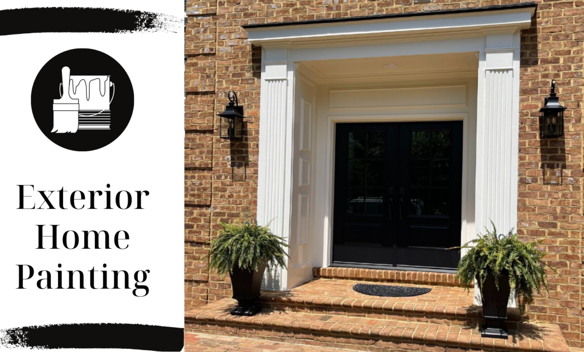
Exterior Home Painting

It’s Spring!, the time of year when people are beginning outside projects on their homes. Oh, how we love a beautiful bed of new flowers!  It’s the perfect time of year to upgrade your grill and outdoor entertainment space in preparation for all the planned cookouts. Did you know it is the ideal time of year to paint the exterior of your home? It’s not too hot or too cold which is not only essential to the painter but to your home’s exterior surfaces. Painting the exterior of your home provides aesthetic and functional benefits.  

Reasons to Paint Your Home Exterior

Better Curb Appeal

According to the National Association of Realtors, buyers today consider a home’s curb appeal as one of the six most important criteria when deciding to purchase a home.  Having an appealing exterior entices the potential buyers to want to take a look inside.  If the exterior is poorly kept then the buyers might take one glance and keep on driving.  Have you ever heard of the phrase about judging a book by its cover? Even if you are not looking to sell your home, curb appeal is important to a lot of people because it adds a sense of pride.  Having a fresh coat of paint on the exterior is giving your house the look it deserves, plus it will leave a lasting impression on your neighbors.  Some of the most popular exterior paint colors are neutrals such as white, gray, and tan.  Bold colors are welcomed as accents, such as your front door and window shutters.

Protection Against Weathering

The paint on your house protects and shields the siding from nature’s ailments; wind, rain, snow, and sun can be tough on the exterior of your home.  It can increase the lifespan of your siding.  Moisture can cause the exposed siding to expand and soften leading to further paint cracking, flaking, and peeling. A new coat of exterior paint will prevent moisture from seeping into your home which inhibits the growth of mold and mildew that lead to rot.  There is nothing that can be done about rotten wood except for being replaced.  Replacing wood can be expensive especially when it comes to the structure of your home.  Therefore, covering up blemishes before they have time to progress is extremely important.  Additionally, the sun can cause paint to fade and weaken the integrity of the paint.  Not only will a fresh coat of exterior paint brighten the appearance of your home, it also adds protection from the sun.

Help Prevent Insect Infestation

Termites have the capability of demolishing a wood home.  It is imperative to receive regular home inspections for termites and there are additional measures that you can take to protect your home from these pests.  Adding exterior paint covers up cracks that they use as access points and can stop an infestation from occurring.  An additional option for prevention is to apply a layer of borate-based wood preservative before painting.

Inexpensive Renovation

An exterior paint job is one of the cheapest renovations you can do to your home.  It has a considerable return on investment because the increase in the value of the home is greater than the cost to have the home professionally painted.   

Exterior home painting is a budget-friendly springtime renovation.  Having your home exterior regularly painted keeps it looking beautiful and gives it a strong defense against weather and insects. It improves the appeal, function, and value of your home. 


Spring Pastel Paint Trends

Pastels lend a dreamy background; they are crisp, uplifting, and luminous. Light-enhancing pales awaken the senses creating serenity and making room for play. New paint has the power to self-express and energize moods.  If your idea of spring cleaning involves giving your walls a fresh coat of paint, you’ll want to have a look at these pastel color trends. 

Subtle Sage

Green is a botanical shade.  It is the color of nature, newness, and growth and offers a revitalizing atmosphere. When green is softened enough, it can serve as a neutral color and can be paired with bold accent colors.  A subtle green is possibly the most popular paint color trend for Spring 2022 because it was picked by two of my favorite paint brands as their Color of the Year.

Benjamin Moore’s Color of the Year 2022 is October Mist 1495.  It is a quiet and meditative shade yet offers diversity and can be substituted as a neutral because it works with many different colors, textures, and elements.  “Due to its calming nature, this gently shaded sage works particularly well in a bedroom or study, and we also love the soothing mood it creates in a bathroom,” says Andrea Magno, Benjamin Moore’s director of color marketing and development.

Sherwin Williams’s Color of the Year 2022 is Evergreen Fog. Just as the fog clears with the rising of the morning sun signifying a new day, Evergreen Fog inspires us to begin again.  It is an attractive color of green meeting gray that is versatile. “It’s a usable mid-tone that allows you to put a personal stamp on your home without having to jump into really bold or bright color,” explains Sue Wadden, director of color marketing at Sherwin-Williams. 

Soft Citrus Yellow

Yellow is the shade of optimism and joy.  It allows you to infuse sunshine into a room, creating a summery feel.  A soft citrus yellow is preferred over gold paint and quieter than highlighter shades. It can be chalked up for a more subtle appearance or accented with dark gray or black to create a modern look.

An astonishing choice for a soft citrus yellow comes from Farrow & Ball’s California Collection, Citrona.  They describe it as “inspired by the lemon trees that thrive in California’s temperate climate, this softened citrus shade is an earthy, contemporary take on a true chartreuse.”

Dusky Blue

Blues evoke a breath of fresh air. They calm us and make us feel relaxed.  Adding a tranquil dusky blue to your home brings a sense of the outdoors inside. It goes well with white for a coastal appearance or natural wood flooring and accent furniture for a warming ambiance.

A terrific option for a dusky blue is Farrow & Ball’s California Collection: Hazy. It is described as a “muted blue-grey inspired by the marine layer that brings drifts of dreamy fog inland, capturing the fresh feeling of early mornings on the coast.”


Colors that Calm

Leave bold bright colors behind and surround yourself with soft, soothing shades to create a calming atmosphere.

Have you ever walked into a room that felt like it was shouting at you?  These rooms can be lively and fun but don’t create a space where you can reach full relaxation as they stimulate the brain and energize.  Everyone needs rooms in their homes where they can retreat and feel at peace.  Color can influence our mood and affect our well-being.  Luckily, there is an array of colors that have been proven to calm.

Serene Greens

It comes as no surprise that greens are easygoing since it is a color found abundantly in nature.  It can be uplifting and invigorating if it is a vibrant shade but a soft shade is soothing.  A living space popping with a serene green will make you want to kick back and relax.

Baby Blues

From the sea to the skies, most people feel at ease and may even doze into a nap when staring across a horizon where the two meet. Therefore, blue is the perfect color for the bedroom because it can calm a busy mind, giving you the ability to sleep like a baby.  

Earthy Neutrals

Neutrals are an obvious choice when it comes to a calming color scheme but can appear lackluster or even chilly. For that reason, it is important to introduce richer neutral shades to warm up the space.  Great examples are terracotta, rust, burnt orange, and chocolate to give you that cozy feeling inside to put yourself into a tranquil state of mind.  Additionally, the texture will give neutrals depth; you could have woven fabric throw pillows, a leather chair, or basketware storage to add in more versatility.

Dark Colors

Just as you begin to wind down as the sun goes down, dark colors help the mind wind down.  They create a restful atmosphere and are often showcased in furniture pieces and as a backdrop on walls.  Popular colors are forest green, dusky blue, navy, khaki, bronze, and dark gray.  You can balance the space by having light wood flooring and accenting with pale colors. Metallic and glass accent pieces complement dark colors very well and add a subtle shimmer.

Stress can creep up on you, may it be that there just aren’t enough hours in a day or the strain of work. Fortunately, having calming colors in the home subconsciously helps you leave your worries at the door.  


Kelley Astore Interiors

Expert Interior Design & Renovation Services of Every Style.

Where We Work

Northern Virginia, Washington, DC,
and the Greater Washington Area

GET IN TOUCH
Connect

Privacy Settings
We use cookies to enhance your experience while using our website. If you are using our Services via a browser you can restrict, block or remove cookies through your web browser settings. We also use content and scripts from third parties that may use tracking technologies. You can selectively provide your consent below to allow such third party embeds. For complete information about the cookies we use, data we collect and how we process them, please check our Privacy Policy
Youtube
Consent to display content from Youtube
Vimeo
Consent to display content from Vimeo
Google Maps
Consent to display content from Google
Call Now ButtonCall Us For A Quote!