

The Pantone Color of the Year for 2019 is “Living Coral”
Every year for the past 20 years, the Pantone people have chosen a color of the year. This choice influences many aspects of design, not just paint color. Textile design, home furnishings, fashion, cosmetics (blush, lipstick, nail polish), home accessories, stationery, packaging, and more are all influenced by this color choice.
(Read More Below)
This year that color is Living Coral. A color that Pantone describes as embracing us with “warmth and nourishment to provide comfort and buoyancy in our continually shifting environment. In reaction to the onslaught of digital technology and social media increasingly embedding into daily life, we are seeking authentic and immersive experiences that enable connection and intimacy. Sociable and spirited, the engaging nature of . . . Living Coral welcomes and encourages lighthearted activity. Symbolizing our innate need for optimism and joyful pursuits, . . . [it] embodies our desire for playful expression. . . Living Coral emits the desired, familiar, and energizing aspects of color found in nature. . . [T]his vivifying and effervescent color mesmerizes the eye and mind.”
How is it selected?
How do the Pantone people select the color? They describe the process this way:
“The Color of the Year selection process requires thoughtful consideration and trend analysis. To arrive at the selection each year, Pantone’s color experts at the Pantone Color Institute comb the world looking for new color influences. This can include the entertainment industry and films in production, traveling art collections and new artists, fashion, all areas of design, popular travel destinations, as well as new lifestyles, playstyles, and socio-economic conditions. Influences may also stem from new technologies, materials, textures, and effects that impact color, relevant social media platforms and even upcoming sporting events that capture worldwide attention.”
Why We Love It
I am especially thrilled that Living Coral was chosen as the color to highlight this year. It is one that I gravitate to in everyday life. Coral brightens my spirits during the winter months and is a constant “go-to” color during the summer months. The clothes that I choose to wear, the accessories that I choose to put with these clothes, are coral or a version of that color. Here are a few of my favorite ways I’ve seen it used lately:
One Example we LOVE of the use of Living Coral
Another Example of Beautiful Use of Living Coral
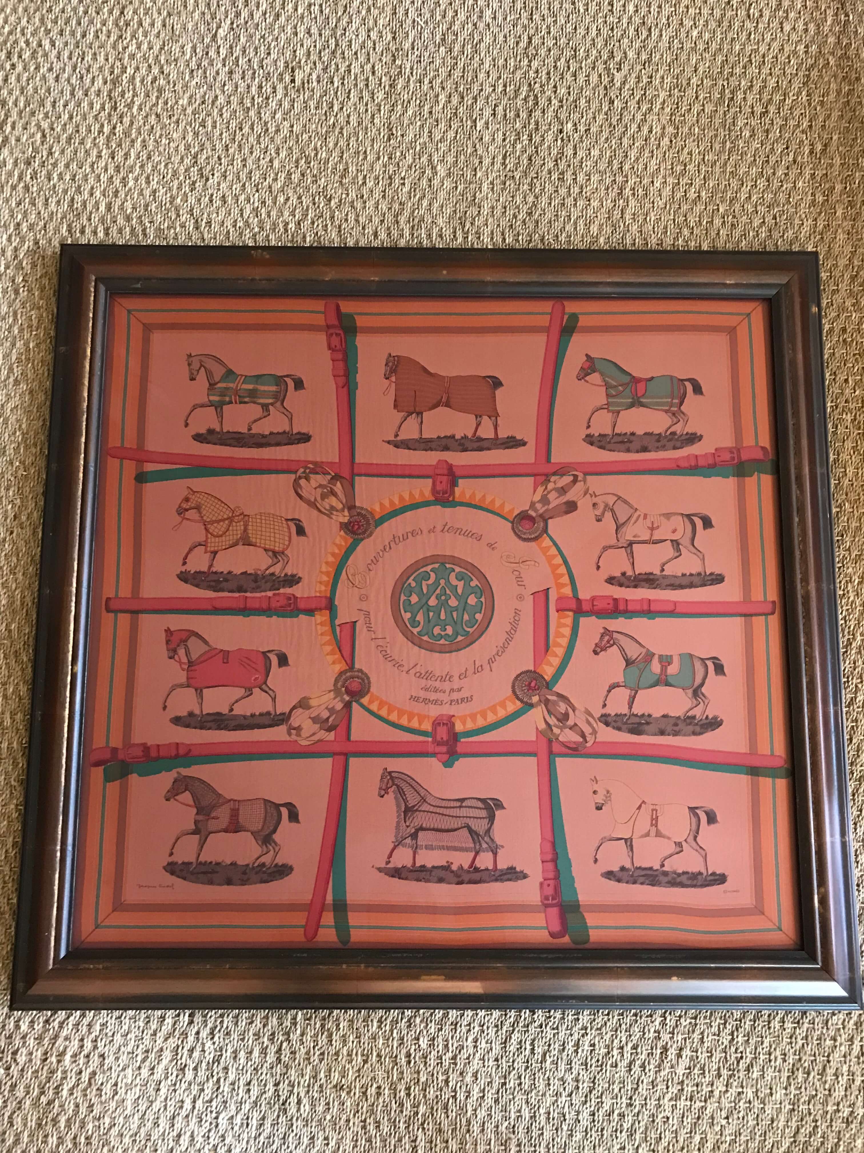
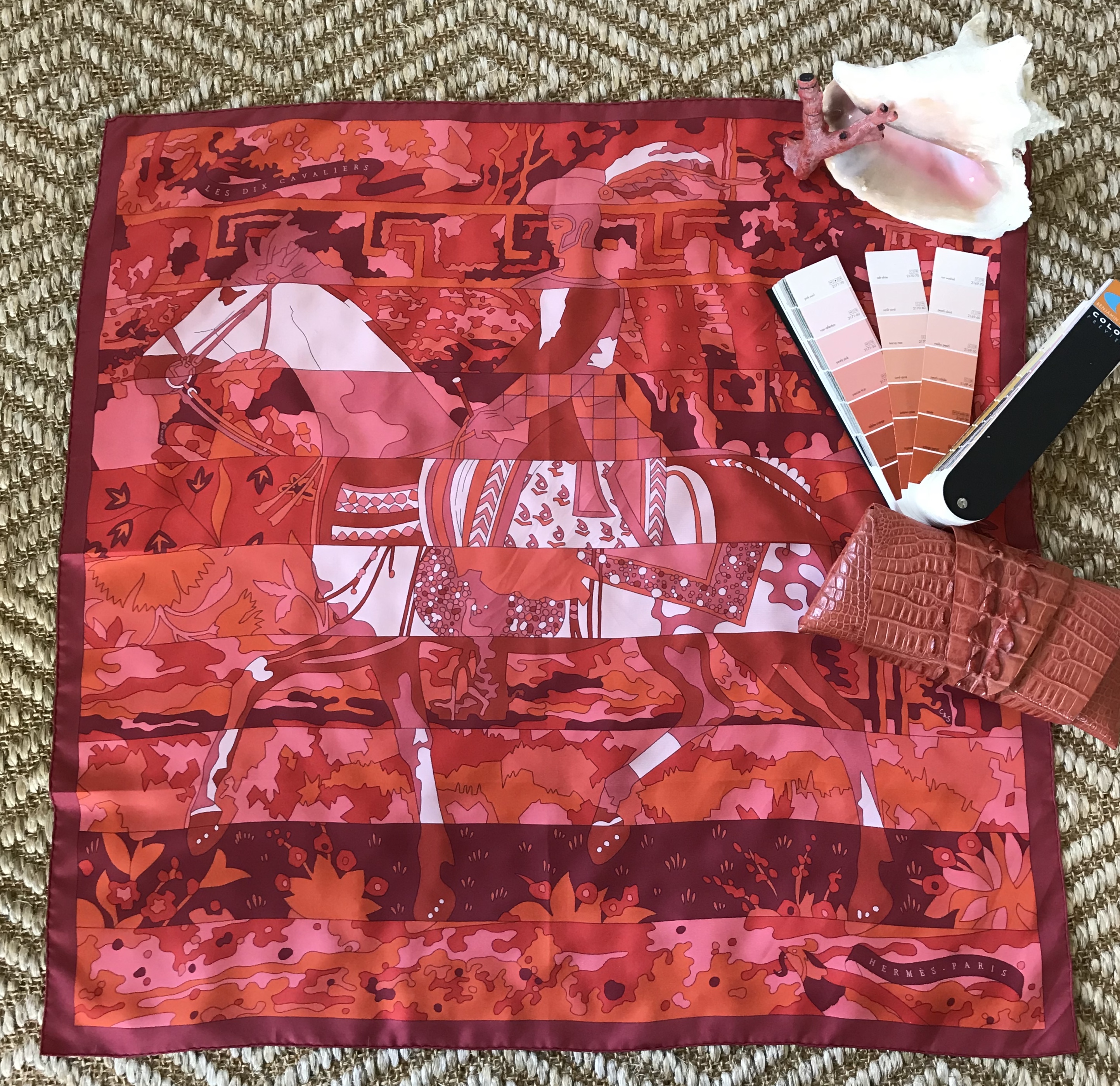
Coral is a color bursting with energy and warmth. So I often design with it. For example, I may select conch shells, which exhibit this beautiful hue in the shell interior, to accessorize an entrance hall table. It is a wonderful color to use on interior walls. It makes a pleasing and eye-catching impact in an entrance hall or a powder room. I have several Hermès scarves full of a variety of coral hues. I have often framed them for a vibrant splash of color on a wall where I might otherwise use a picture.