
How to Choose Paint Colors That Flow from Room to Room
When you are choosing the colors for a house, it is important to be aware of how they flow from room to room. Let’s explore how to choose the paint colors that suit your project, the best ways to test them before even touching your walls, and how to integrate it all with your home. We will use one of my recent home renovations in Reston as an example!
Why Does the Flow of Color Matter?

Flow from room to room is incredibly important!
Color integration is crucial in a home! When you are sitting in a home, the views from one room to the next should be pleasing and restful to the eye rather than jarring. This is particularly important on the main level of a home when the rooms tend to lead into each other, versus upstairs bedrooms which can be more segmented. Not all colors work together and it’s easy to focus on each room’s aesthetic individually without thinking about their cohesion. Our tip is to always look at the sightlines from each room to see which rooms open to the others. Upstairs, make sure the landings and passages are painted or wallpapered in something harmonious with the rooms that lead off of them.
Color Inspiration for the Kitchen:
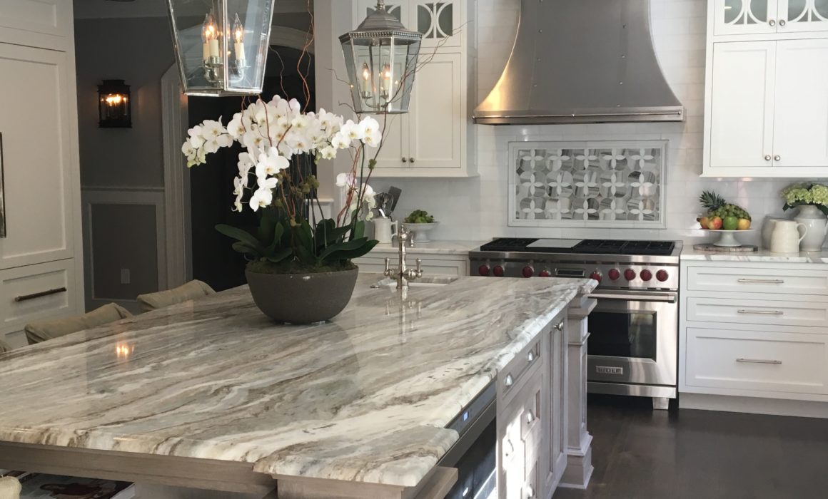
This countertop was the inspiration for the paint colors that we’re chosen for the first floor of this home in Reston.
We started the project by choosing a piece of granite for a rather large island that would turn out to be the centerpiece of the entire first floor of this wonderful house. The granite that was chosen had veins running through it that were soft gray, pale gray-green, taupe, black, ivory, and white. A most unusual, but magnificent, slab of granite purchased at Marble Systems in Vienna, Virginia. The island was stained a custom color of gray that blended beautifully with the granite countertop. For all other countertops in the kitchen and butler’s pantry we chose a white Calacatta marble, as to not distract from the beautiful island granite.
Testing the Colors:
At the beginning of every painting project I always advise making test boards both for the wall colors and the trim color typically a “white” which I usually choose to run through the entire house. By painting the boards, you can experiment with the color before you paint the entire room. Almost all of the major paint companies make tester sample pots of paint. Farrow & Ball make small tester paint pots of almost their entire line of paint. Benjamin Moore makes two-ounce samples available in 260 of their best colors from designer favorites, classic hues, and the hot new trends.
Color Inspiration for Staining
Beyond the walls, you have to think about the other structures in your home, like islands, cabinets, floors, and built-ins. In this case, we choose the paint for the walls and cabinetry and the fabrics for upholstery and draperies solely based on this wonderful island granite countertop. Specifically for the kitchen walls, we chose a pale gray, Benjamin More #860.
Our next step, and certainly one of the most important, was to choose a stain for the wide plank oak flooring that would flow through the first two floors of the home. A brown stain with a touch of gray was our final choice. Just like the walls, if you’re planning to take one flooring throughout the house, it needs to work with all the rooms you’ll find it in!
Color Inspiration for Furniture
For the furniture, you can either work forwards or backward. If you already have some amazing pieces, work with those to find your best colors. This project was the opposite. My client’s love for beautiful fabrics and furniture prompted us to start searching the Washington DC Design Center for special pieces for the first floor of the house. We needed seating for the kitchen and breakfast room so we purchased counter chairs from Lee Industries and had them slipcovered in a very durable faux gray ostrich skin, keeping in line with the grays from the counter. The breakfast room chairs were purchased at Restoration Hardware, and we’re upholstered in light-colored taupe linen. If my client ever needed extra seating, we had these chairs upholstered in a neutral fabric so they could be moved from room to room.
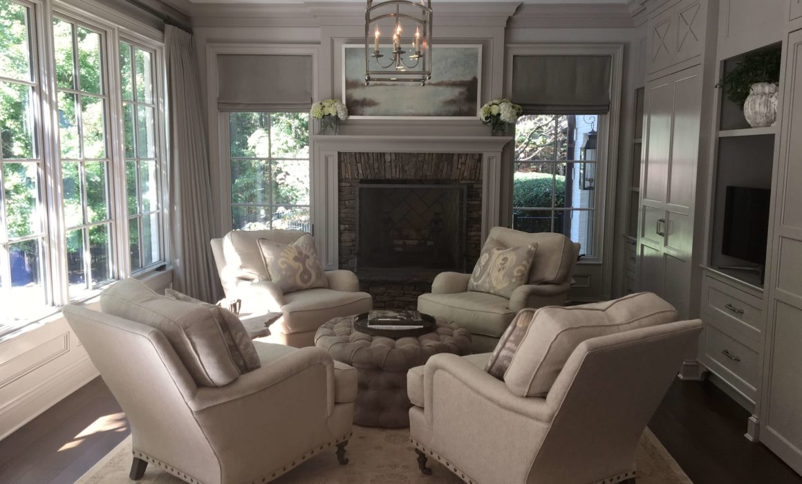
Color Inspiration for the Hearth Rooms
Paint colors were chosen to match the stone fireplace
The next room we tackled was the hearth room. An adjoining room, directly off the kitchen/breakfast room. We chose the paint color Benjamin Moore number 861+25%. To make a paint color flow from one room to the next, I often add 25% or more to the paint formula, continuing the paint color flow from one room to the next. Some paint companies can alter the formulas of their paints, others cannot. So always be sure to check when starting a project.
“To make a paint color flow from one room to the next, I often add 25% or more to the paint formula, continuing the paint color flow from one room to the next.”
The hearth room has a wonderful stone fireplace, the stones were handpicked to blend with our soft gray paint color scheme. My client knew that this room with its beautiful fireplace would get the most use of any other room in the house. A very comfortable seating arrangement of four custom made club chairs upholstered in a neutral cotton fabric. We found a wonderful Pindler and Pindler fabric for the throw cushions. The fabric has an all-over pattern and has both pale yellow, grays and whites perfect for our very neutral linen club chairs. A beautiful faux suede tufted ottoman was made to sit in the middle of the four chairs, now all we need is the hot chocolate!
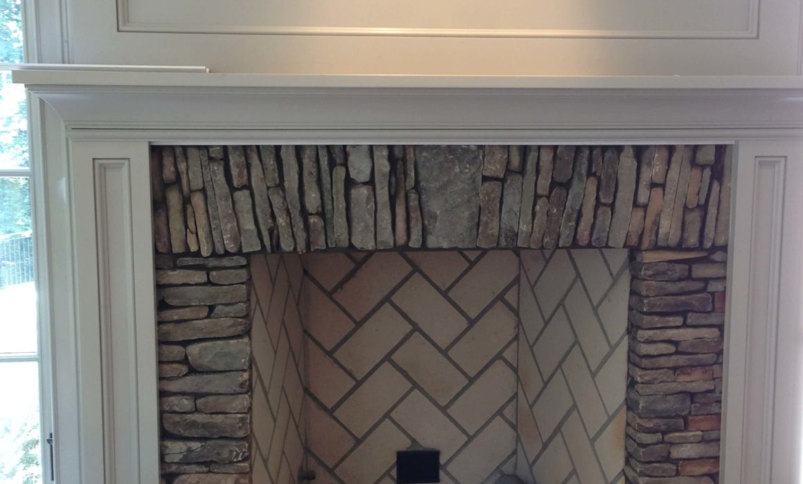
From the granite countertop/ island in the kitchen to this stacked stone fireplace in the hearth room the different gray paint colors flow from room to room.
A custom bookcase was installed on the right side of the room. It was also painted in a variety of pale gray paint colors to accent the beautiful moldings. On the left side of the room, there were floor to ceiling windows framed with draperies made from dark gray linen from Holly Hunt.
Color Inspiration for the Great Room
The great room/family room certainly the largest room on the main floor. The walls and coffered ceiling were painted Farrow & Ball #242 Pavillion Gray. This room had another massive bookcase that was designed to stand alone like a piece of furniture. This one received Farrow & Ball #88 Lamp Room Gray, to stay in the same color but add intrigue and not look like one color everywhere.

A sofa and loveseat were custom made in a beautiful taupe colored linen. We found a beautiful Lee Jofa Susani woven fabric for throw cushions for the sofa and loveseat. The fabric has gray, gray-blue and taupe and blends beautifully with our Farrow & Ball wall color. A custom made ottoman upholstered in a pale gray-blue Travers fabric was made for the middle of the room. The ottoman has silver nail heads around the base which adds to the all-over silvery grays of the room. For extra seating, we added two custom upholstered gray leather swivel chairs to sit in front of the bookcase.
Gentle transitions in color make a house more mature and livable. Paint should enhance the architecture rather than overpower it. If you are feeling overwhelmed about how to integrate your style into your home and across room to room, we’re here to make this transition easy and best reflect your style!